
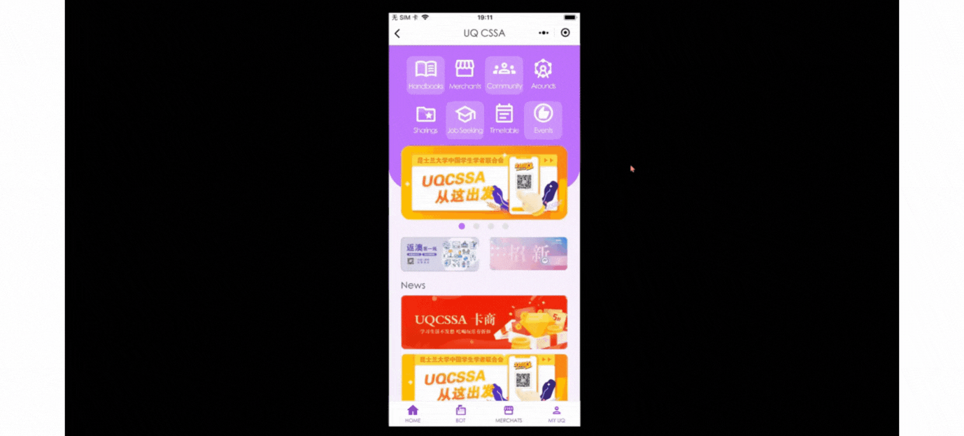

This is the framework of the first version. It serves as the blueprint for the design, with meticulous attention given to the placement of each function, including icons, carousels, and more. The sketch provides a clear visual representation of the layout, ensuring that every element is positioned precisely as intended. By following this framework, we can confidently move forward with the development process, knowing that the design and functionality are thoughtfully planned.
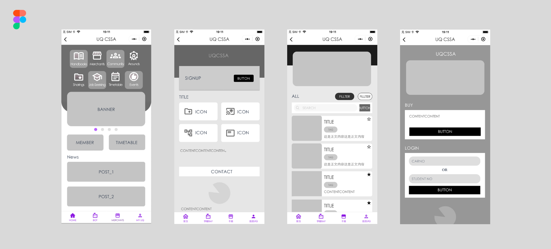
Building upon the framework, I made a second iteration by incorporating theme colors and icons. However, feedback received indicated concerns about the light color and complexity of the function jump area. I address these issues by exploring alternative color options for better contrast and simplifying the function jumps for a smoother user experience.
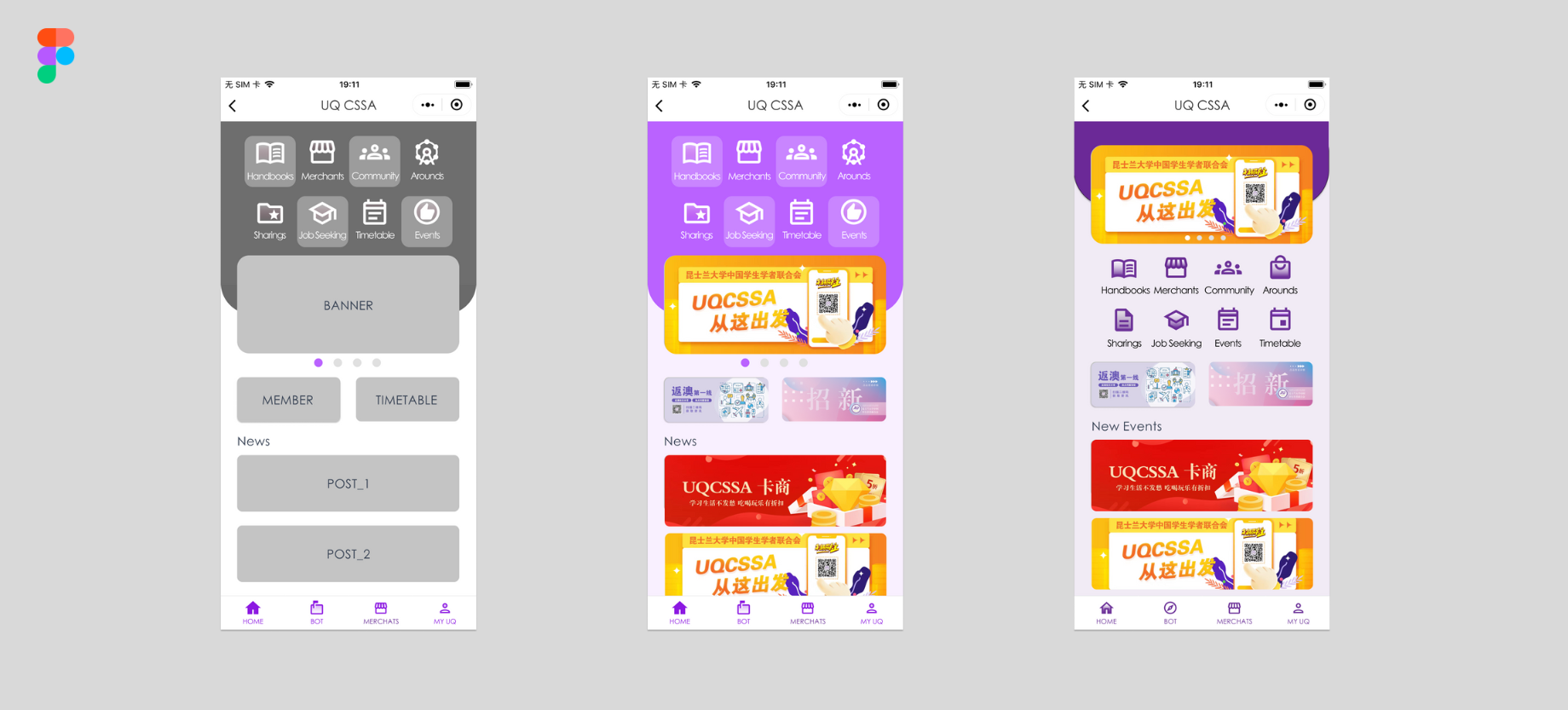
Once the layout and style design were finalized, I proceeded to apply the design across all frame design drawings, ensuring consistency and cohesiveness throughout. The completed style design was then presented to the client as the final version. By encompassing the entire project with the chosen style design, we aimed to deliver a visually unified and polished outcome.
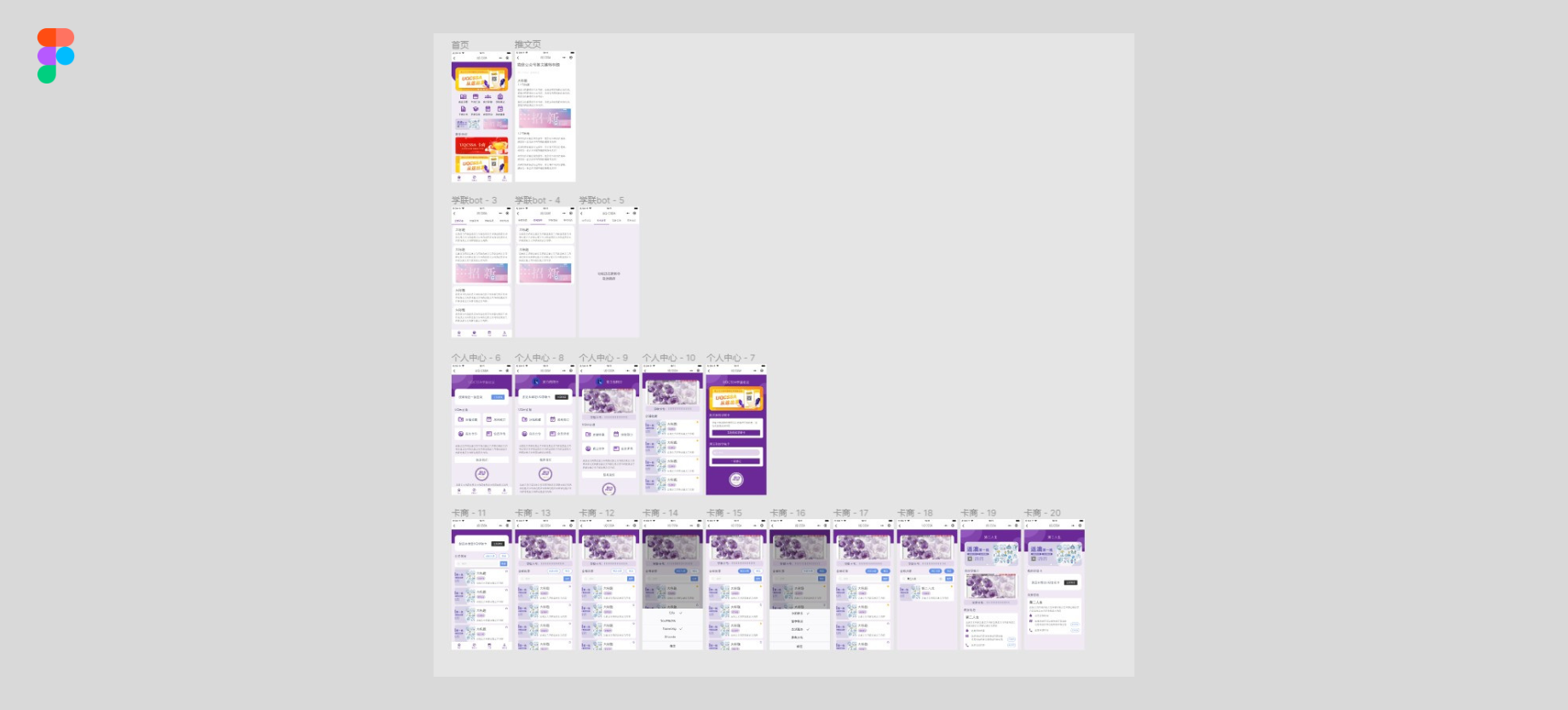
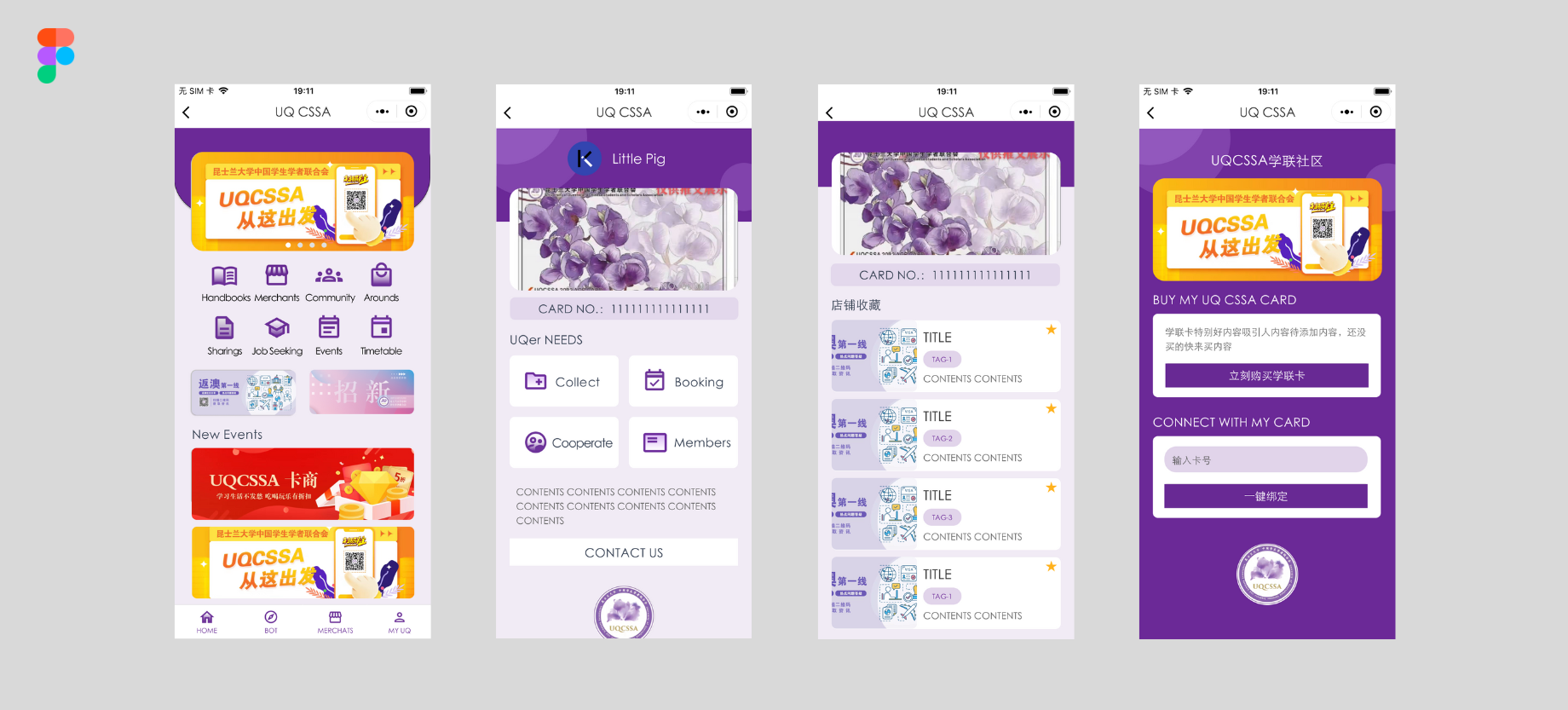
This is the presentation of the final design draft, showcasing the culmination of our efforts. The color scheme is inspired by the distinctive purple hue of the UQ school badge, ensuring a strong visual connection to the institution. The chosen style reflects the preferences of the students, creating a design that resonates with their tastes and preferences. I believe this combination of color and style will not only capture attention but also foster a sense of familiarity and affinity among the target audience.


